I had the chance to work on the Miss Lulo homepage, and I must say, I LOVE working on eComm homepages!
Here's the before:

Here's what I first noticed:
- The heads are cut off
- There's not much exploration encouraged
- There's no "brand"
But after speaking with the founder, I was delighted (yes, seriously delighted) to uncover some GOLD NUGGETS for the Miss Lulo brand.
Here's what I found out:
- Prints are all original (huge)
- 1950s style dresses
- Popular silhouettes
- Plus-sizing galore
- Super interesting backstory
I proposed we focus on the original prints because that's exactly why people keep coming back to Miss Lulo.
So without further ado, here's the After:

Here's a condensed list of everything I updated (from top to bottom):
Header
- Cleaned up cluttered menu items to the most important
Hero section
- Updated copy
- Created colorful banners using Miss Lulo original prints
New Arrivals
- Included automatically updated "New Arrivals" section, right below the Hero.
Bright Banner
- Created Banner with beautiful original print that guides website visitor to ALL DRESSES (most popular category)
Shop by Prints
- Added a "Shop by Prints" category to make it easier to shop while highlighting the fact that the prints are key to Miss Lulo
Promo Banners
- Added 2 colorful promo banners (Featured Print + Now on Sale)
Shop by Category
- I kept this to make sure we didn't confuse past website visitors who used this section.
- I did reduce the number of categories though.
Popular Silhouettes
- The founder told me that there were popular silhouettes that buyers kept coming back for, so I added that.
Miss Lulo In Real Life
- The Miss Lulo Instagram page featured a lot of fans showing off their Miss Lulo dresses. They were colorful, super adorable, so we decided to showcase them on the homepage. Community is everything, after all.
Wholesale Banner
- At the end of the page, we shoutout to the potential wholesalers using a beautiful banner featuring Miss Lulo prints.
- The banner takes them to the form where wholesalers can apply to purchase in bulk.
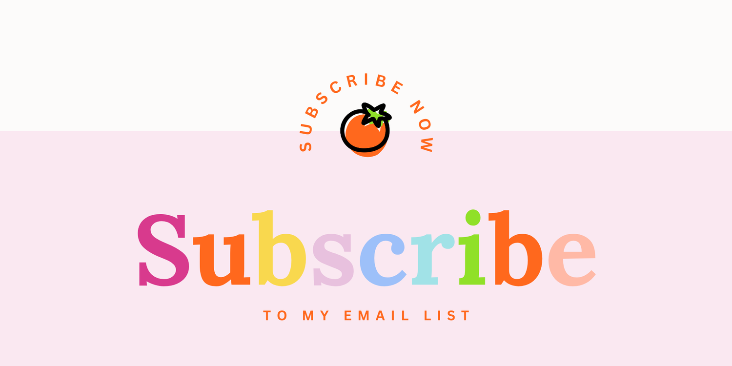
Subscribe Slide-in
- Instead of an annoying pop up, I decided to include a smaller slide-in that literally slides in from the right bottom side of the screen.
- It's not as annoying as a pop-up and hopefully it will convert.
Email-Related
- Since I'm also working on their email automations and campaigns, I will be adding in special discounts for subscribers soon. We are currently working through approvals.
- I have cleaned up her Klaviyo lists, segmented them, and in the process of implementing all the flows (welcome, winback, abandoned checkout, etc etc). More to come on that!
Anyway, that's it!
There are a lot of ideas you can steal from here for your own ecommece homepage.
But if you need extra help making the homepage match your email campaigns, don't hesitate to reach out by filling out this form here.
In the meantime, have a great day!
Cin